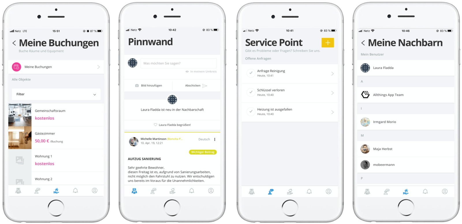
Allthings introduces new App Design

New year, new app design!
At Allthings, we are constantly improving our product and offering. So, we are kicking off 2020 with a more modern and slick design of our Allthings tenant app.
Following the request of our customers, we have therefore shifted towards a more brand-neutral appearance of the app.
Allthings CPO Eric Aplyn says: 'The design and layout of any app is crucial. The user should know what they can do at a glance - and the layout, the colors, the text are guides to effectively understanding and making use of the features. We invest in new design to offer our users and customers an intuitive, smart and easy to use tenant experience.'
The new app design brings a sense of consistency in terms of colors and icons across all MicroApps. However, it is not only pleasing to the eye but new buttons and layouts within the app also make it easier to navigate for our users.
